Putting users first: Swiss Volley partners with foryouandyourcustomers to redesign its website
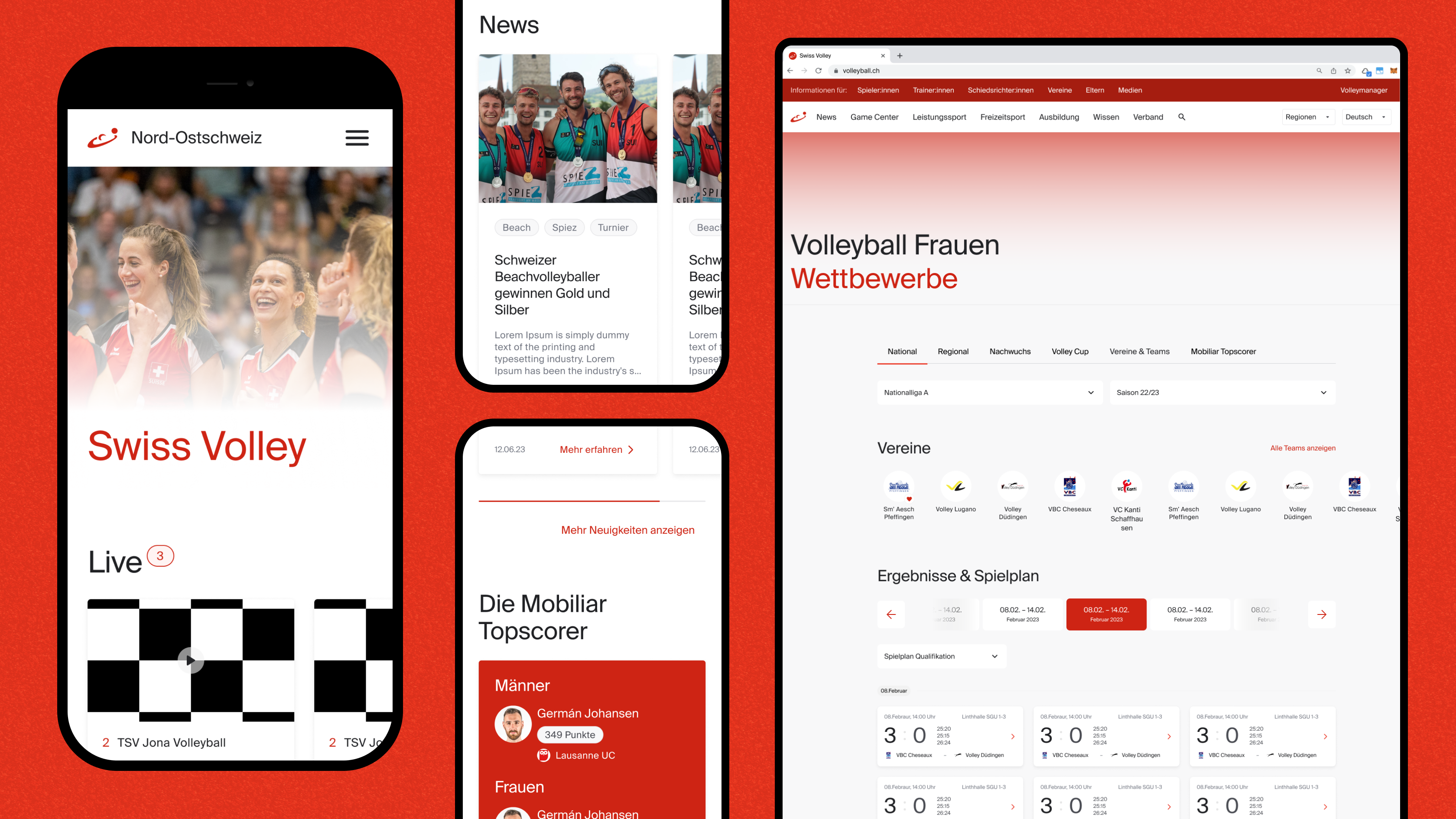

Swiss Volley represents the second largest team sport in Switzerland and is responsible for the development of volleyball and beach volleyball.
In collaboration with foryouandyourcustomers, Swiss Volley successfully redesigned its website, launched in August 2024. This redesign not only improved the user experience to deliver tangible benefits to various user groups but also strengthened collaboration with regional associations. Foryouandyourcustomers had the opportunity to guide Swiss Volley in designing their new platform with a user-centric mindset and are excited to share some insights into the journey of completely overhauling a content-rich platform and the challenges that such endeavours can bring.
Swiss Volley has chosen foryouandyourcustomers as its trusted partner to lead the transformation of its website into a user-centric platform tailored to meet the diverse needs of various user segments, including fans, players, trainers, and referees. "I immediately sensed the clarity in the approach of Marco Torrente and his team, and that instilled confidence in me," expressed Ursula Gugger Suter, Head of Communication at the association and the driving force behind the website project.
The diverse requirements for the redesign
Swiss Volley is Switzerland's national governing body for volleyball and beach volleyball. It represents nearly 50,000 licensed players and is responsible for developing the sport in the country. As an umbrella organisation, Swiss Volley acts as an organiser, service provider, and lobbyist for volleyball. As such, it has to deal with various stakeholders and target groups and aims to reach them as effectively as possible – also online.
Consequently, understanding and responding to diverse requirements and perspectives was key to the redesign, according to Gugger Suter. As Project Lead and Service Designer, Marco Torrente suggested a series of expert interviews and workshops to involve representatives from regional associations, aligning the Swiss Volley team's objectives and expectations with those of its various user segments, including fans, players, trainers, and referees.
From the very outset, it became evident that engaging with authentic users was paramount for crafting a website that resonated with their needs and preferences, and for rigorously testing new concepts. What initially presented itself as a formidable hurdle evolved into a success, all owing to meticulous planning and a well-orchestrated strategy for recruiting genuine users.
"While the previous website was created from the inside, i.e. from Swiss Volley, our focus was on the view from the outside, the people that experience the website as users."
— Marco Torrente, Service Designer
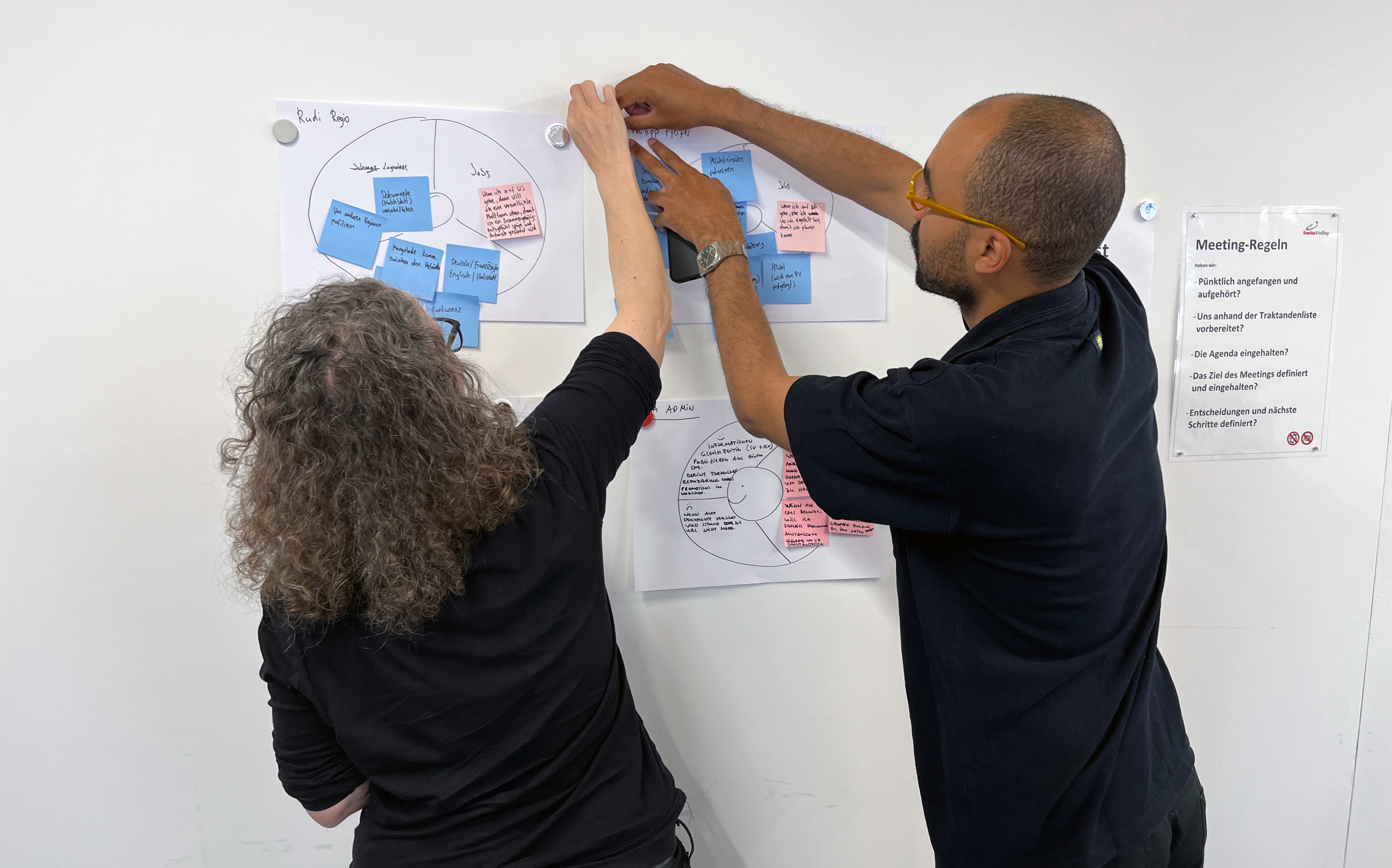
David and Ursula co-creating user profiles.
A Design Sprint to foster collaboration between national and regional association
To kickstart the journey toward a new website, Torrente leveraged the Design Sprint approach, allowing Swiss Volley to explore and validate ideas with a user-centred mindset quickly.
In the case of Swiss Volley, the sprint felt like a sporting competition in which I was the coach. The participants brought the appropriate sports mindset, which resulted in effective decision-making.
— Marco Torrente, Service Designer
One integral component of the Design Sprint was a two-day workshop with the Swiss Volley team, utilising their comprehensive knowledge and empathy for end users to generate the initial artefacts of a potential new website. These artefacts were then consolidated in a digital prototype, which was tested in the same week with real users representing the diverse user groups. This approach enabled the design team, consisting of Marco, David and Gavi, to validate key assumptions and prioritise the most desirable features quickly.
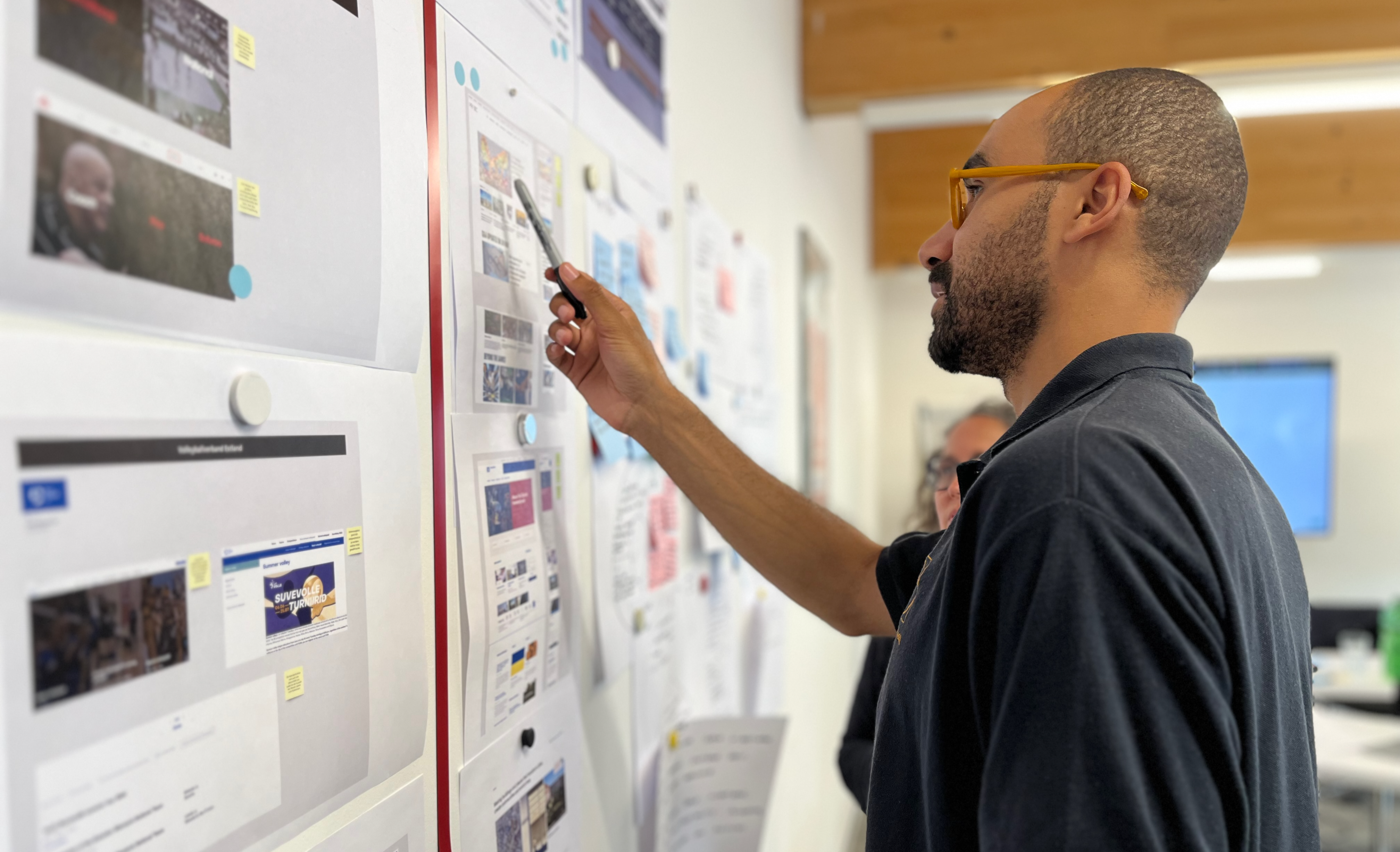
Evaluation of benchmark examples
A new information architecture to make information easily accessible
One major headache we uncovered during the Design Sprint was the daunting complexity of the old website's navigation, leaving users frustrated as they hunted for information. However, the bright side that became clear to the team during the Sprint was that the website's wealth of content opened the door for a thorough rethink of organising it to cater to different user groups effectively.
"Our goal for the redesign was to simplify access to information for everyone who needs something from the association. No one should get lost in the amount of information or have to click through several steps to get to certain results."
— Ursula Gugger Suter, Head of Communication Swiss Volley
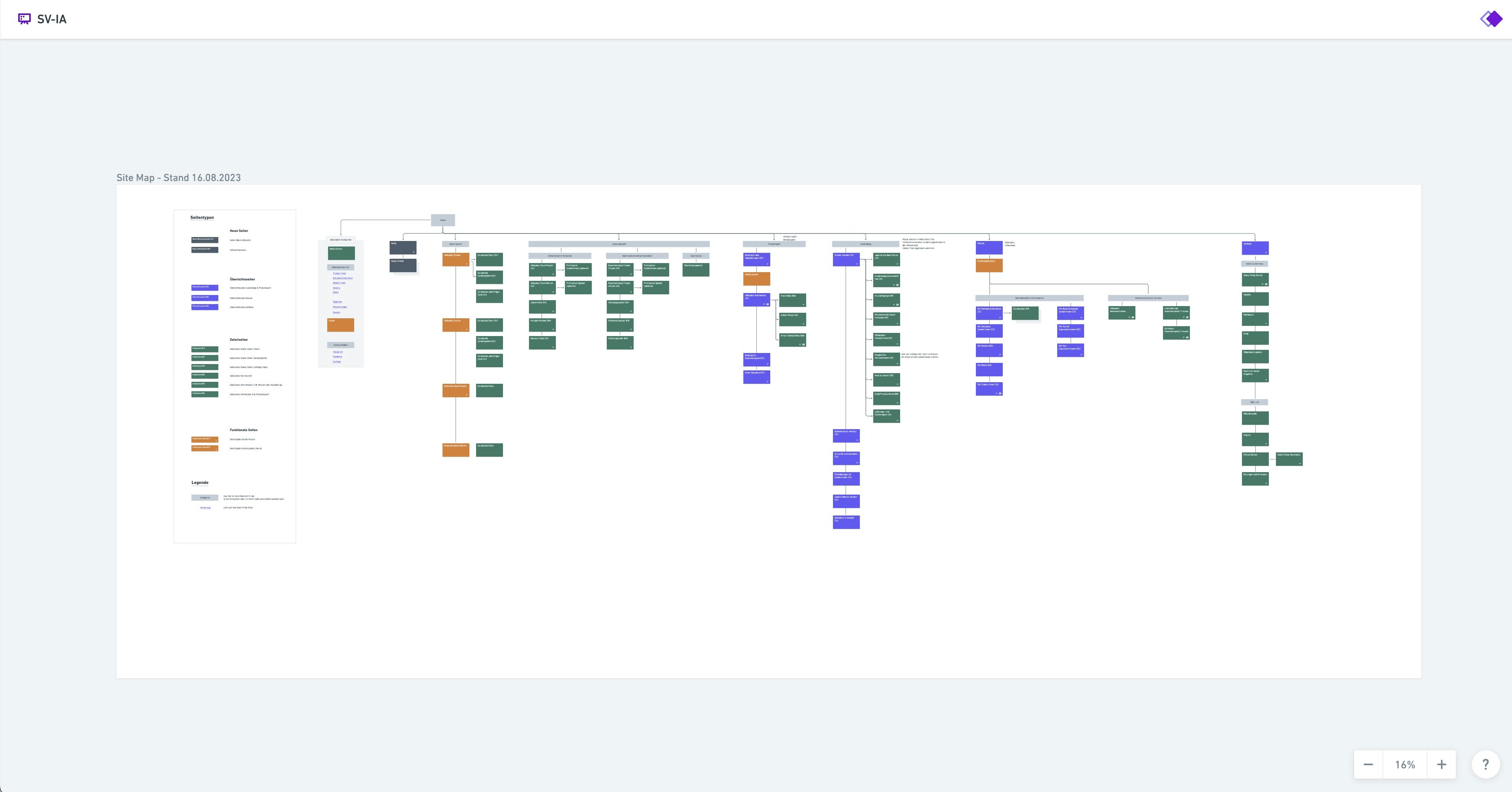
To address this, the team developed a new information architecture aimed at improving website navigation and ensuring users could quickly and easily access the information they required:
Content should be organised in a way that makes sense for users.
The website should be easy to search.
Users should be able to find the information they need quickly and easily.
Information Architecture
The team also made sure to include the following features in the new website:
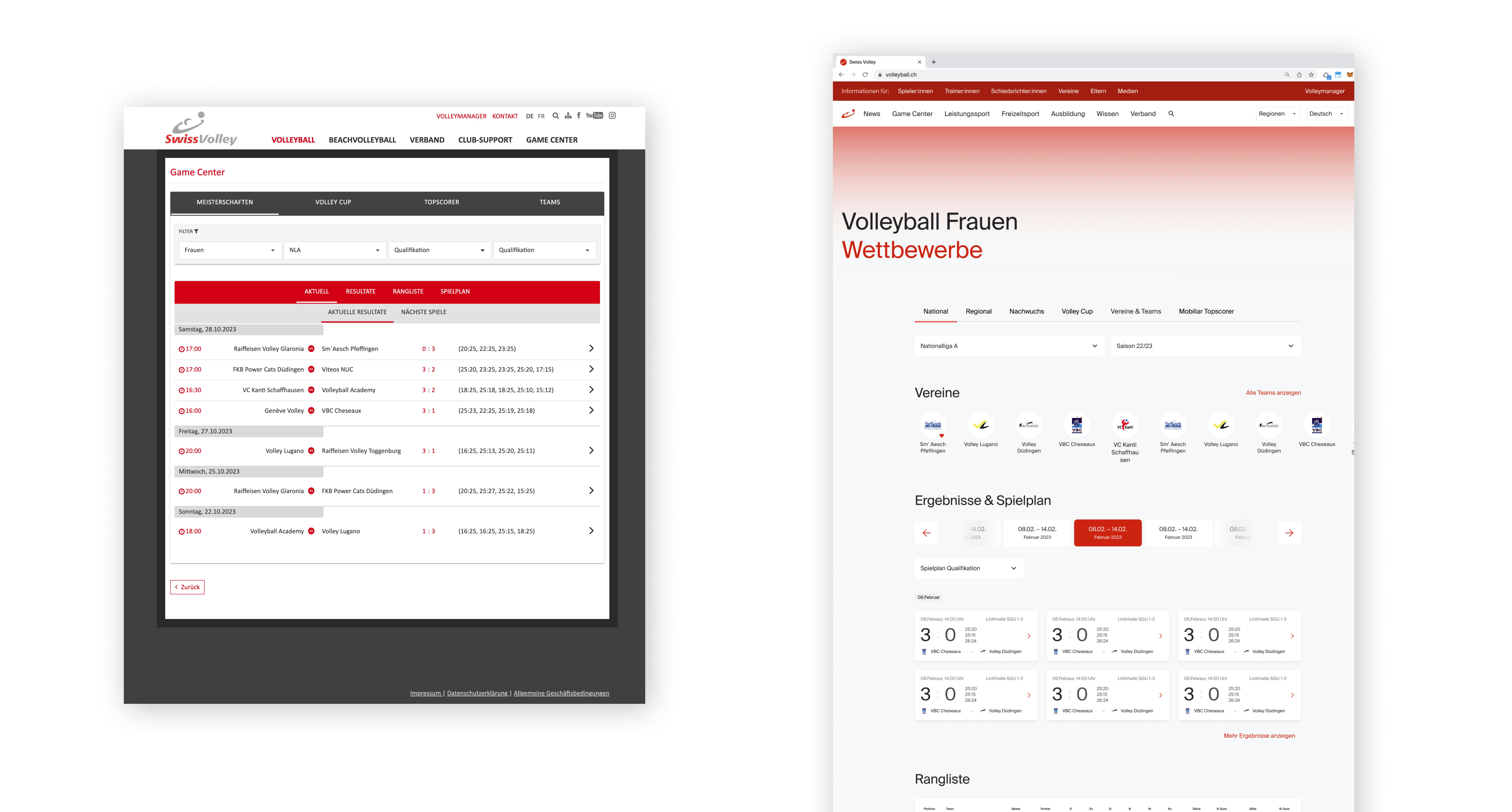
A redesigned game centre for easy access to information about upcoming matches and results.
A dedicated knowledge area for important volleyball information, thoughtfully structured to cater to users based on their specific roles within the sport, such as trainers, players, or fans.
A news area to keep users updated on the latest news and information about different teams.
Game Center before (left) and after (right)
Bringing the new design language to life
After redefining the information architecture, the design team embarked on creating a brand-new visual language that seamlessly blended aesthetics with functionality. They actively collaborated with end users and stakeholders to ensure the website not only pleases the eye but also prioritises user-friendliness.
Inspired by Switzerland's typographic heritage, the team selected a typeface that combined tradition with a fresh, contemporary look. The association's signature red colour and thoughtfully chosen imagery were employed to convey the dynamism and emotions associated with the sport.
Switzerland's typographic heritage

A design system was introduced to structure the designs and ultimately create a consistent user experience that reduces the cognitive burden of established design patterns and guidelines. The result is a website that is easy for visitors to navigate, making the experience more enjoyable and intuitive.
Performance with React; Transparency with Storybook
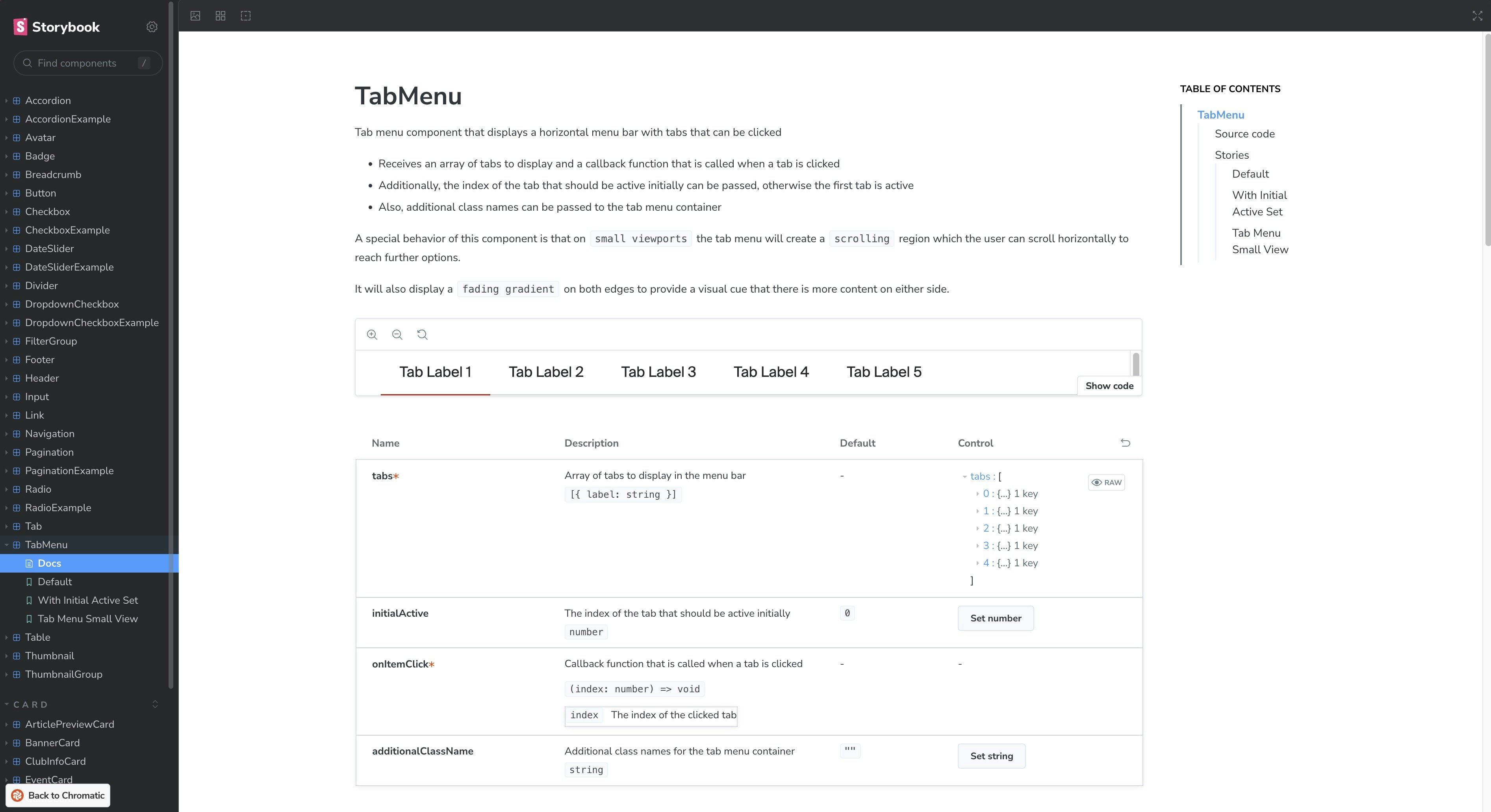
Once the design system was perfected, foryouandyourcustomers’ developers Lisandra and Felipe set out to craft the frontend components using React, ensuring a dynamic and responsive user experience. The Storybook platform was chosen to streamline this process and enhance transparency with the backend partner, visol. Thanks to this solution, visol was able to see innovations and adjustments live and Swiss Volley was able to witness step by step how the design vision was brought to life.
Storybook: Example Tab Menu
Where are we now?
(Update: 22.08.2024)
New website is live!
Visit the new website of the Swiss Volleyball and Beach Volleyball Federation.
The new website, launched in August 2024, reflects a shared vision developed in collaboration with various topic managers and regional teams. Gugger Suter highlights that this update allows those responsible to align and present information and services more effectively to meet users' needs. Employees handling telephone and written inquiries also benefit from the improved speed at which users can now access information.
"The revamped content structure empowers those in charge to align and present information and services more effectively according to user needs."
— Ursula Gugger Suter, Head of Communication Swiss Volley
In a complex network of stakeholders and target groups, we have realised a new website that makes the complexity invisible to users. The association's various target groups can now find their way around more quickly on a modern, easily accessible platform. The relaunch has improved networking between national and regional associations. The website offers a dynamic and responsive user experience, and the new open-source CMS allows for flexible customisation. In addition, the new technological basis has reduced the site's carbon footprint.
This launch marks not just the introduction of a user-friendly website, but also the strengthening of collaboration between Swiss Volley and the regional associations, a testament to the project's success.
Our services
Are you trying to achieve something similar? We are happy to offer you our expertise and experience when it comes to designing and developing new websites – especially if you are also dealing with the complexity of multi-layered networks of stakeholders and target audiences.
Are you seeking help on similar topics? We're delighted to offer our expertise in designing and developing new websites. From strategic planning to crafting immersive user experiences and finally launching your solution, we're here to breathe life into your fresh ideas, products, or services.
Guiding you on the path to a new website
Design sprints to explore and validate creative visions
Discovery Research for in-depth user insights
Rapid ideation, prototype development, and detailed design
Creating thought-through design systems
Crafting front- and backend solutions
Get in touch
Are you curious about what we can do for you, or do you have any questions? Reach out to Marco Torrente at mto@foryouandyourcustomers.com to initiate a conversation about a tailored approach for your company and your specific circumstances.
