New Swisspeers website: now flexibly adaptable thanks to its modular design


An independent crowdlending Platform that allows companies to raise debt capital from investors directly, i.e. without a financial institution.
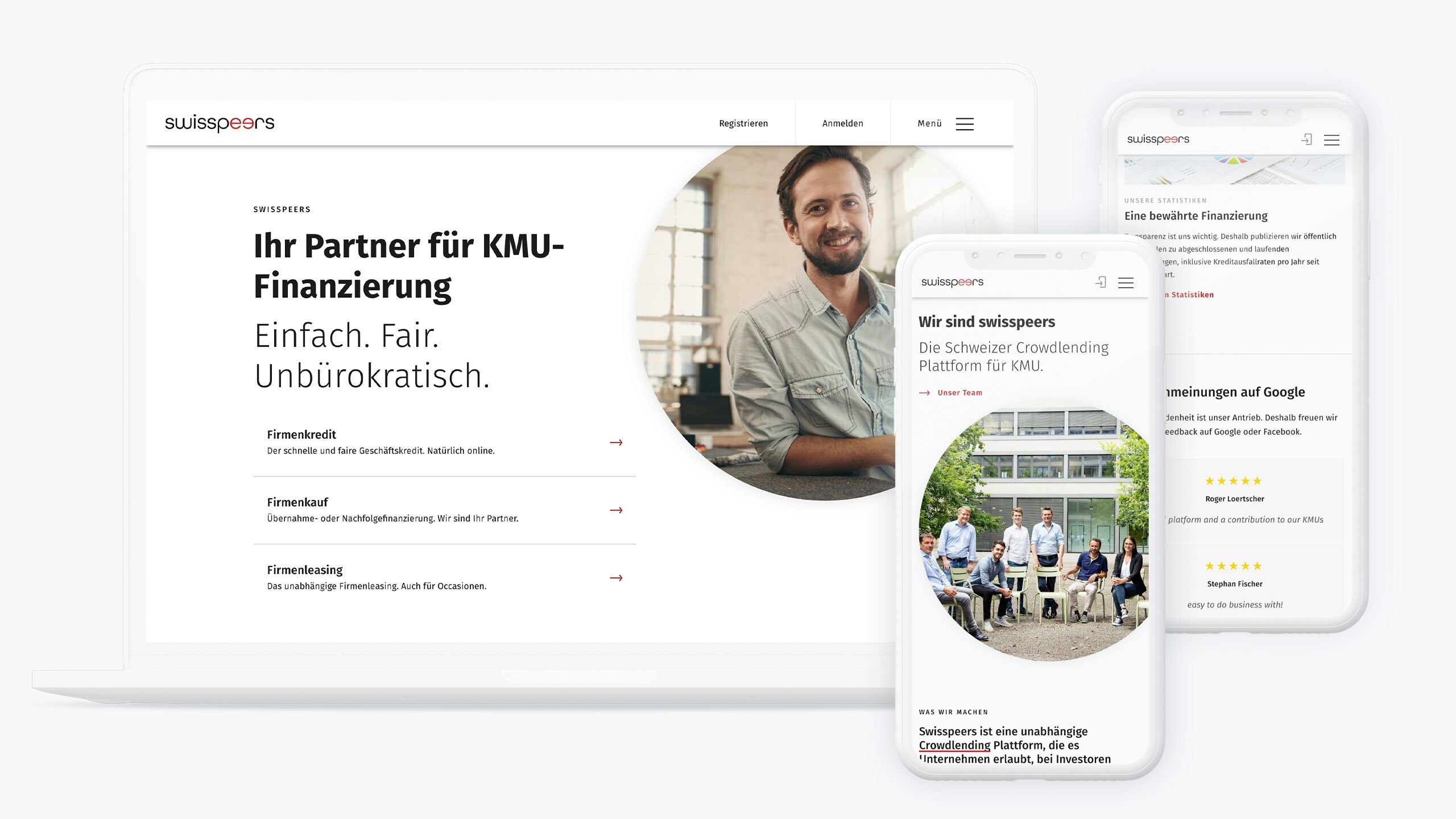
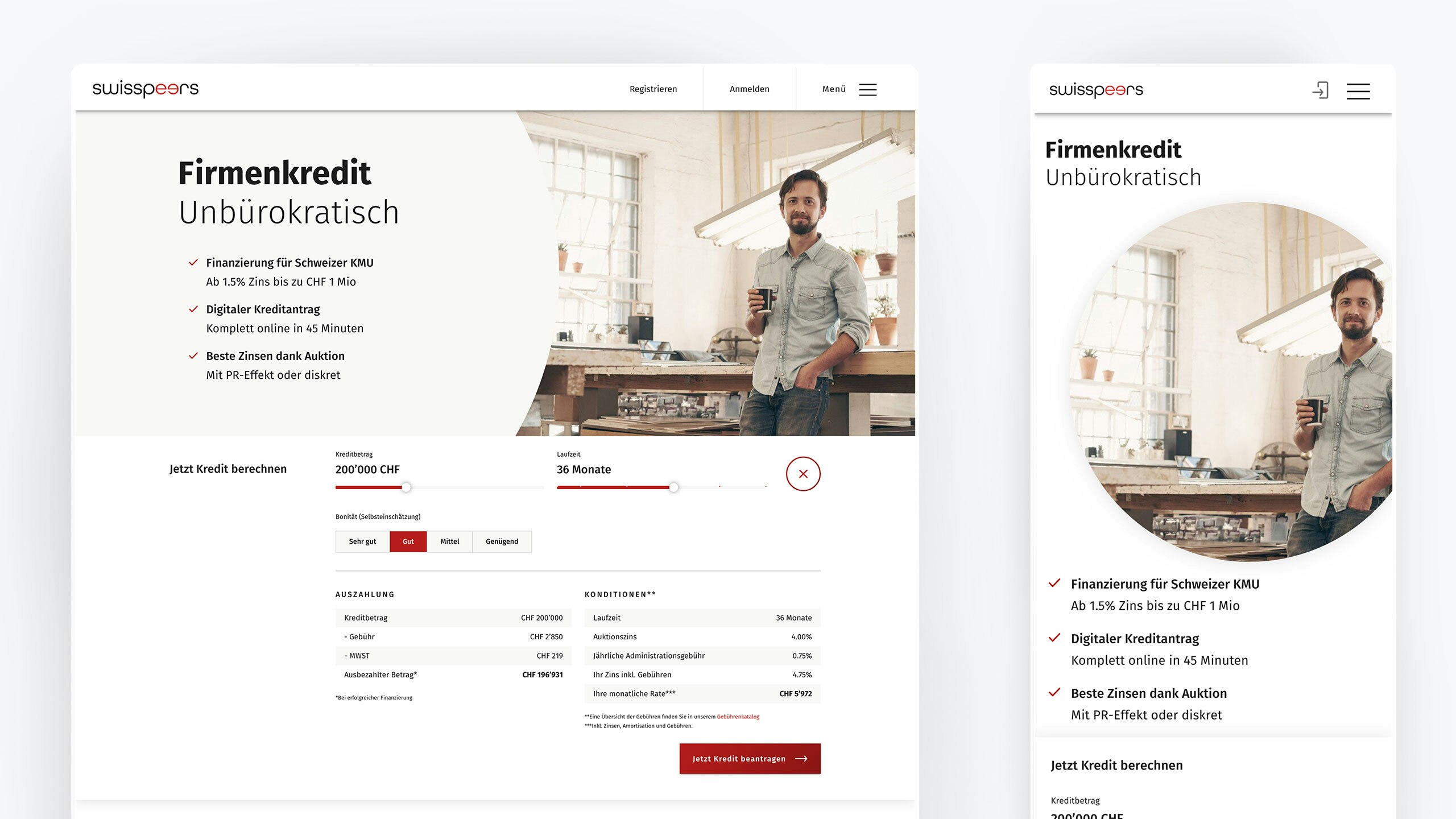
“Your finance partner for SMEs. Simple. Fair. Unbureaucratic.” This is the slogan that introduces Swisspeers, the independent Swiss crowdlending platform for SMEs, to its clients online. It is the brand and image that comes to life in the design, content and handling of the modular Swisspeers website (swisspeers.ch/app.swisspeers.ch) by foryouandyourcustomers Feldkirch.
The first website of Swiss fintech company Swisspeers was built in 2016 using a purchased HTML template. “At the time it was an adequate, affordable tool for a start-up,” explains Stefan Nägeli, “but in the medium term it is limiting and too generic to allow a uniquely developed identity to shine through.” That’s why after the website launched, the company worked with UI/UX experts from foryouandyourcustomers in Feldkirch to refine the platform in an effort to optimise technical options in terms of design and usability.
“With help from foryouandyourcustomers Feldkirch, we were able to strike a balance between creating something fundamentally new in terms of design and language, and still further sharpening our identity.”
Stefan Nägeli, CTO Swisspeers
“With help from foryouandyourcustomers Feldkirch, we were able to strike a balance between creating something fundamentally new in terms of design and language, and still further sharpening our identity: recognisable progress,” Swisspeers CTO Stefan Nägeli puts it succinctly.
“Our collaboration over the past four years is a successful example of how you don’t necessarily have to start off with time-intensive, costly projects in order to create sustainable benefits for your own business,” Claus Stachl, CEO of foryouandyourcustomers Feldkirch, says retrospectively. “Improving UX and UI aspects can also be effectively approached on an as-needed, day-by-day basis. That is what we did with Swisspeers: we worked with them step by step to gradually develop a corporate identity, improve the user experience and shift to digital solutions in line with the current movement.”
First, individual design sessions were held either in the Feldkirch office or on site in Winterthur: they were ad hoc sessions focused on what was needed, primarily for the customer application platform still integrated in the website at the start, and then concentrated on the relaunch project for the website swisspeers.ch.
Swisspeers Mockup-01

“When we started this project in June 2019, we wanted an individually designed website that did not rely on any templates,” Stefan Nägeli says. The objective was to have a website that was “100 per cent user-oriented, sleek and streamlined, with a look that still elicited trust among existing and potential customers, not to mention a website with a high recognition value”.
In designing the new website, the team focused on devising and developing a visual modular system, which allows Swisspeers to implement the individual modules efficiently in response to needs, as it did when it detached the application from the website.
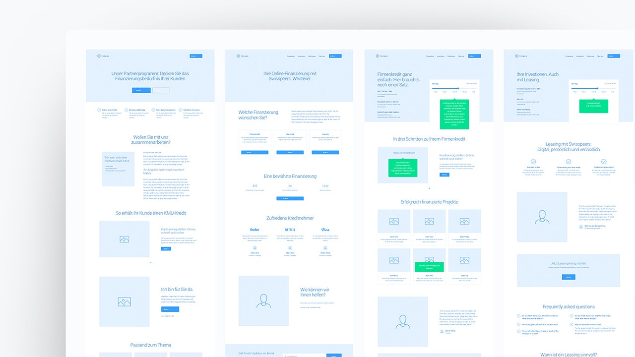
Module development for the website involved outlining the website content using a wireframe kit live in a workshop.

“To do this, the existing site was sketched out with a wireframe kit and the content was disabled in order to restructure it. We managed to do this foundational work in just two design sessions,” Claus Stachl recalls. The visual modules were then gradually designed in work packages in close collaboration with Stefan Nägeli, and then approved by Swisspeers and implemented there.
“We worked together to revise the typography, for example, adapted the design to a new look and feel, discussed and designed individual visual components, all to orchestrate and harmonise everything with each other. Our aim was always to forge a visual migration line along our values and set out our identity, and then ultimately convey this identity even more effectively – and we absolutely succeeded in doing this,” says Stefan Nägeli.
Figuratively speaking, the new website was put together like a house and can now be modified and optimised for continuous improvement of the customer user experience at any time thanks to the modules created. “It makes it easy to continue tweaking the Swisspeers image and/or quickly bring to life landing pages with a changed brand style,” Claus Stachl concludes. “It’s a design system that will continue to live on even after the project finishes. It’s actually stopped being a project in the classical sense, but rather an interworking of design, technology, brand and sales targets.”
