How we achieve a shared understanding in technical diagrams


Representing things schematically is not always easy. I think we can all agree on that. But things can be surprisingly simple. As one of our core values, we try to reflect this in our work as much as possible. Building representations of technical solutions is a prime candidate to do so.
There are many ways to draw a system architecture. In the following article, I will highlight three ways we represent technical solutions to our customers. We believe a map of the technical landscape should have just enough detail for each target audience and still be appropriate for a particular context.
The C4 model
The C4 model, created by Simon Brown, helps software development teams describe and communicate software architecture during up-front design sessions and when retrospectively documenting an existing codebase.
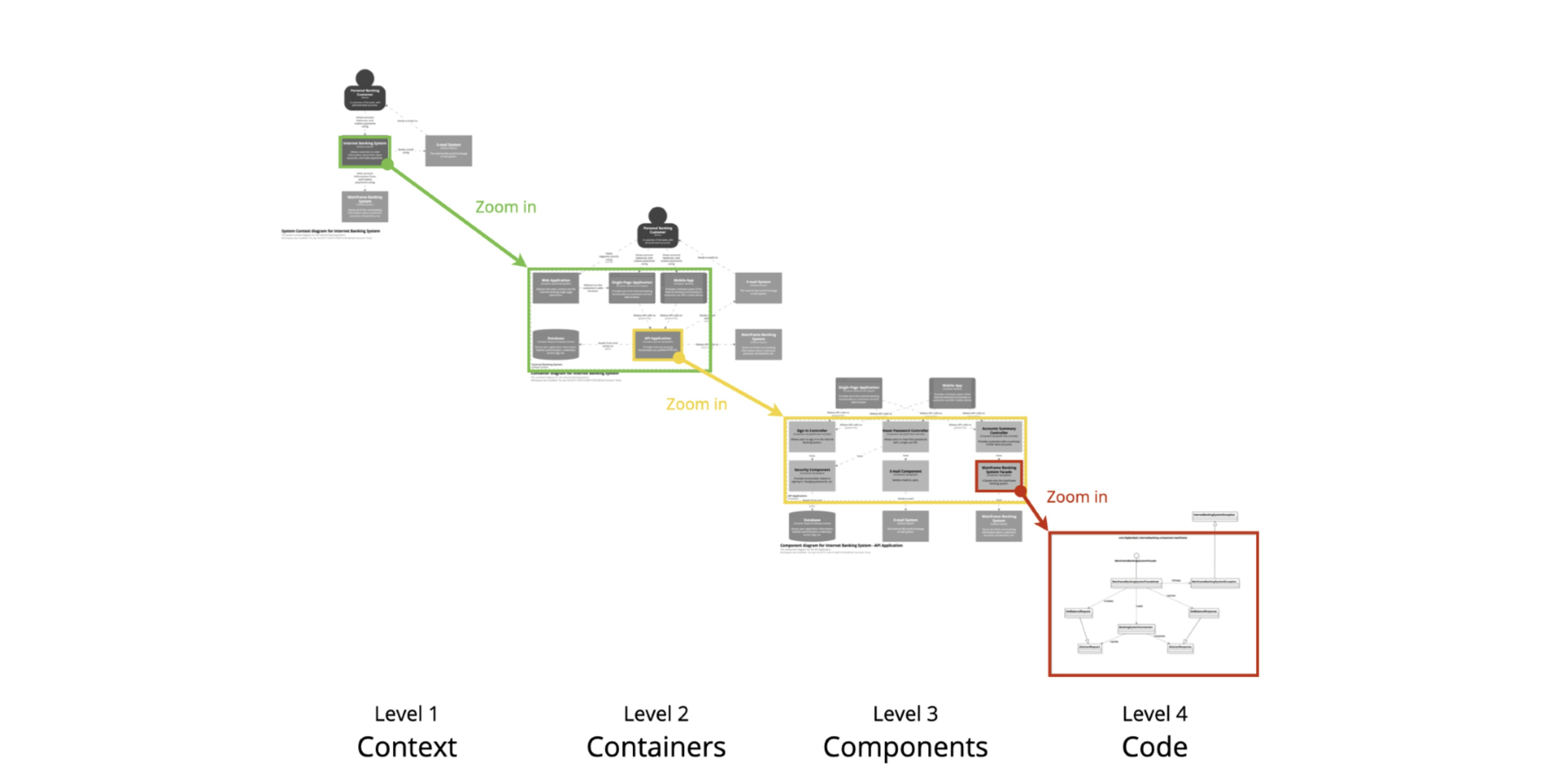
The C4 model for visualising software architecture (Source: C4 model)

When supporting our customers, we face both existing and greenfield projects. In both cases, one crucial step is understanding the landscape thoroughly.
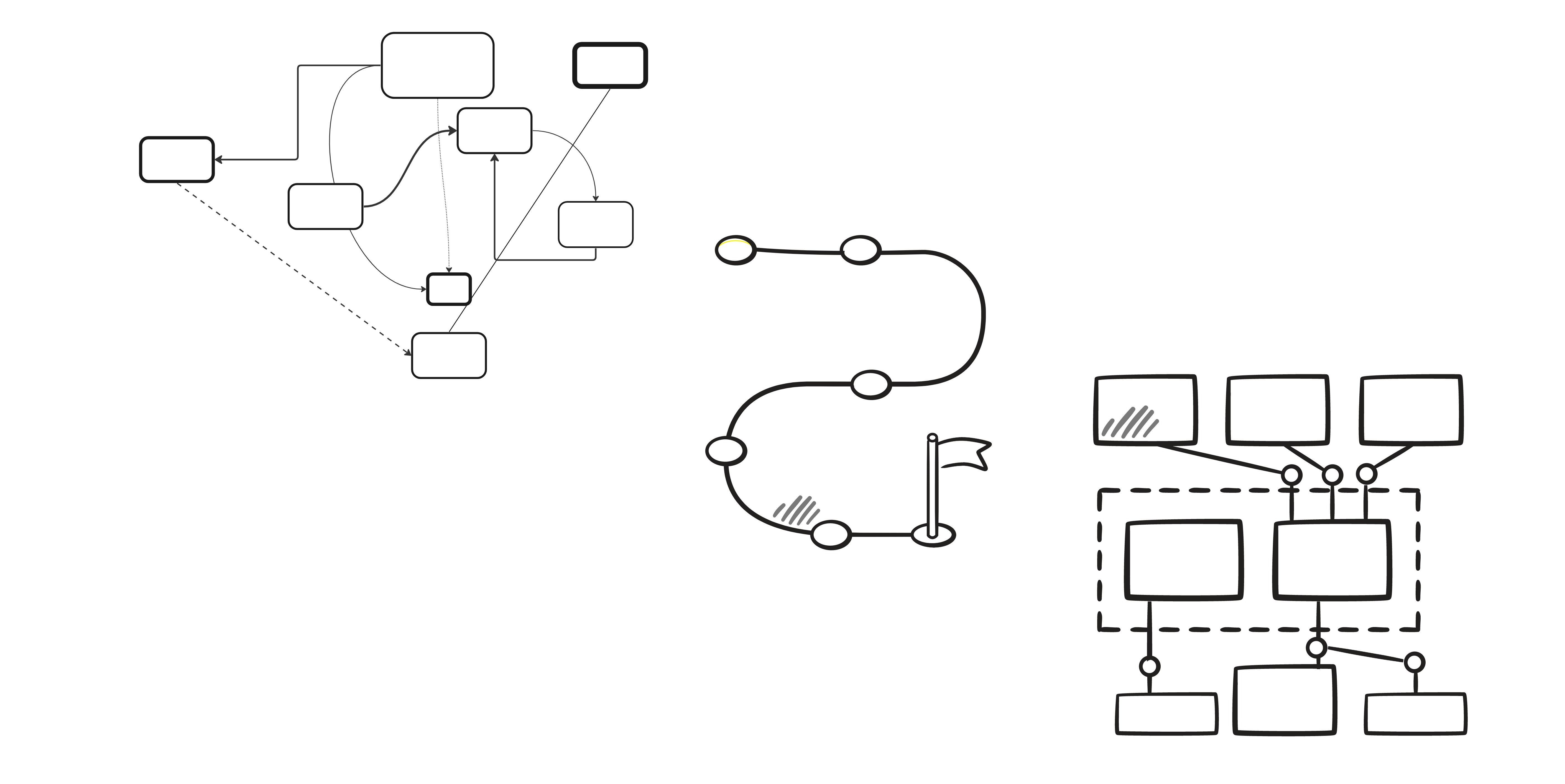
With the C4 model, we can use the hierarchical abstractions and four levels of hierarchical diagrams to provide a good foundation for us and our customers to understand the entire system. And the best part? You do not have to use all levels if you do not need to.
Let us look at the four levels and how to apply them:
System Context diagram: This is the starting point for diagramming and documenting a software system. It lets you step back and see the big picture.
Container diagram: Once you understand how your system fits into the overall IT environment, the next step is to zoom in on the system boundary with a Container diagram. It visualises the high-level shape of the software architecture and the distribution of responsibilities across it. It also shows the major technology choices and how containers communicate with one another.
Component diagram: You can then dissect each container to identify key structural building blocks and their interactions. The component diagram visualises the various "components" that make up a container. It describes each component, its responsibilities, and the technology/implementation details.
Code diagram: Finally, you can zoom in on each component to visualise the implementation of the programming code using UML class diagrams, entity relationship diagrams or similar. This is an optional level of detail and is often available on-demand from tooling such as IDEs.
To learn more about the C4 model, visit their website for more detailed information.
Architecture diagrams using standard icons and representations
When creating solution architectures, we use targeted platforms or (cloud) providers that each understandably use their specific typology, terminology, and representation. Consultants, developers, and architects also use a personal style to visualise ideas.
Intelligent Supply Chain – Retail Diagram (Source: AWS Architecture Diagrams)


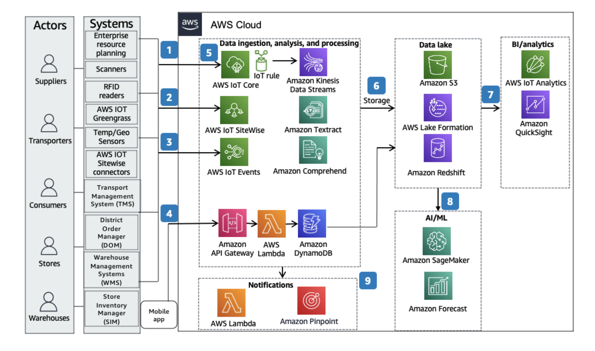
It is essential to be consistent in using designated visual representations to make diagrams easier to interpret. With this in mind, we always use the official icons such providers publish. Most cloud providers offer a clear icon and style guide, such as the AWS icons, Azure icons and Google Cloud icons. Amazon even goes a step further by providing example reference architectures, which makes it easy to adhere to the overall appearance of your architecture diagrams.
Doing things this way ensures consistency and makes interpretation easier. This positively influences the project, as everyone involved gains a shared understanding more quickly.
Exploded View
The Exploded View, developed by foryouandyourcustomers, is a visual representation that helps understand and analyse complex systems or processes. It involves breaking down the system into its individual components or layers and arranging them to show their relationships and interactions.
Different perspectives on the Exploded Views


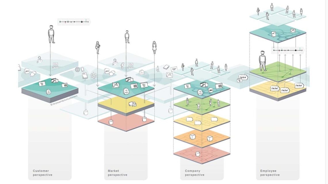
This model is often used to gain insights and identify potential improvements. The model is flexible enough to freely choose any application's relevant focus areas, scopes and depths. Working with the six layers of the Exploded View provides clarity and facilitates collaboration for everyone involved. These layers can be structured and used to generate a variety of perspectives to emphasise, for instance, market or employee specifically.
The Exploded View models a company and its market and customers in six layers:
Customer Layer: The customer layer represents the system's users, focusing on their needs, preferences, and interactions.
Experience Layer: The experience layer is dedicated to providing a positive and engaging user experience through intuitive interfaces, design, and usability.
Organisation Layer: The entire workforce makes up the organisation layer. It encompasses the organisation's internal structure, processes, and culture responsible for delivering the system.
Performance Layer: The performance layer represents all the services provided by the company. The collective contributions of all employees determine it.
Asset Layer: The asset layer consists of all the physical and digital assets, resources, and capabilities that support the system’s operations.
Data Layer: The data layer contains the sum of all data and data structures within a company. Each company operates based on the data it possesses.
If you want to learn more about the Exploded View model and how to work with it, please visit our official website.
Summary
When dealing with system diagrams, building a shared understanding for each participant that is surprisingly simple to consume and interpret is important. We achieve this by using standardised abstractions, recognizable pictograms and a shared language that is easy to understand.
If you want to learn more about foryouandyourcustomers or the services we offer, please visit our Amsterdam page or contact me directly at ald@foryouandyourcustomers.com.